Compact Hybrid Phone UI: Iterative Usability Testing

Usability Testing
UI Design
UX Research
Accessibility
Type of Project:

UI Evaluation

Overview

The project was a second round of user testing on a senior-focused phone interface and its core apps. Six seniors worked through realistic task scenarios, from dialing and contact creation to organizing and removing apps. The interface was received positively overall, with familiar patterns and a readable screen, while The project was a second round of user testing on a senior-focused phone interface and its core apps. Six seniors worked through realistic task scenarios, from dialing and contact creation to organizing and removing apps. The interface was received positively overall, with familiar patterns and a readable screen, while navigation entry points, app management terminology and the keyboard emerged as key improvement areas.entry points, app management terminology and the keyboard emerged as key improvement areas.
Process

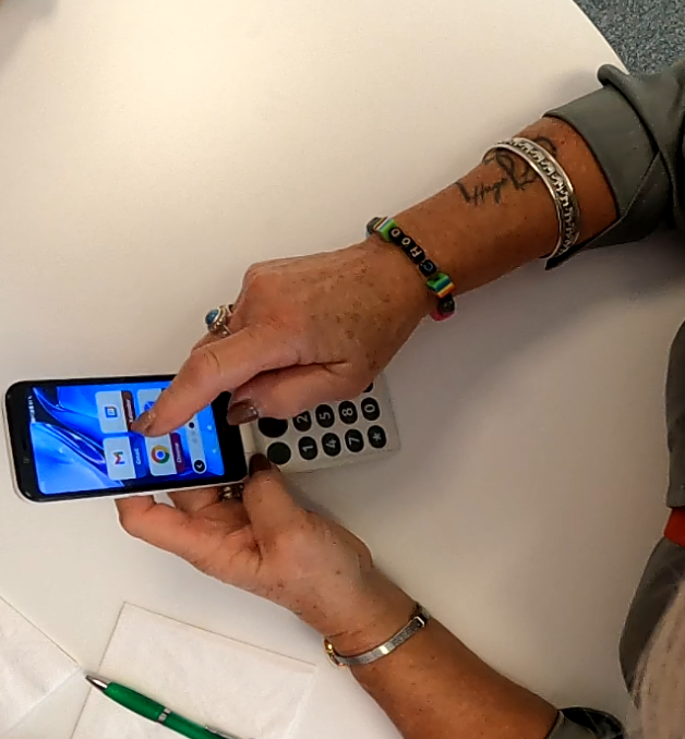
The study followed a structured moderated usability protocol.

  • Opened with an interview on daily phone use, mapping behaviors across morning, daytime and evening.
  • Documented pain points with participants' current phones, covering app clutter, accessibility, notifications and feature gaps.
  • Collected first impressions of the hardware and interface before task work began.
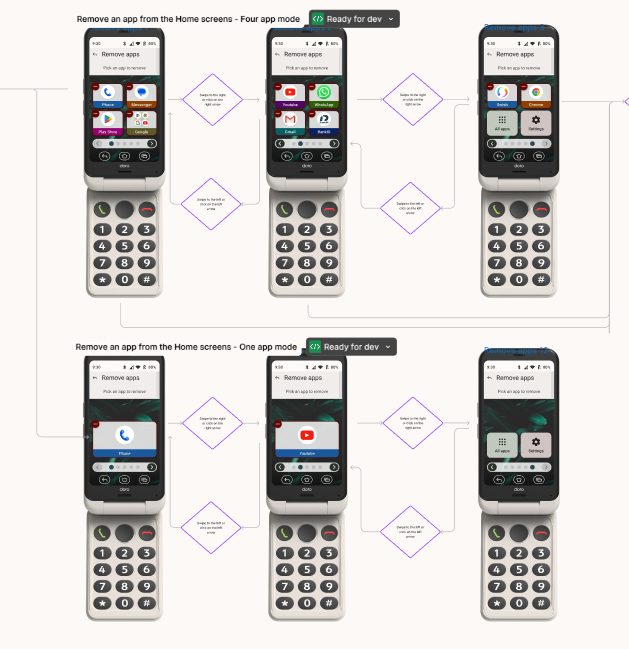
  • Ran task scenarios covering core UI flows: dialing and contact picking, adding contacts, adding favorites, finding apps, organizing and removing apps, and using the camera.
  • Logged pain and gain points per task, distinguishing UI friction from learnable behaviors.
  • Gathered general impressions after testing, plus reactions to three form factor models.
  • Closed with a standardized user experience questionnaire.
outcomes

The interface validated well overall, with clear priorities for the next iteration.

  • The numpad, large readable screen and familiar call flow were strong gain points.
  • Users missed the entry points for calling and favorites, and got lost returning to the start screen.
  • App management terms like Replace confused users, and the difference between remove and uninstall was unclear.
  • Small text in the All Apps menu and an undersized keyboard were the main UI pain points; dictation was suggested as an alternative input.
  • Users were confident they would adapt with practice and considered the phone easy to recommend.

Check out more projects

View Projects
View Projects